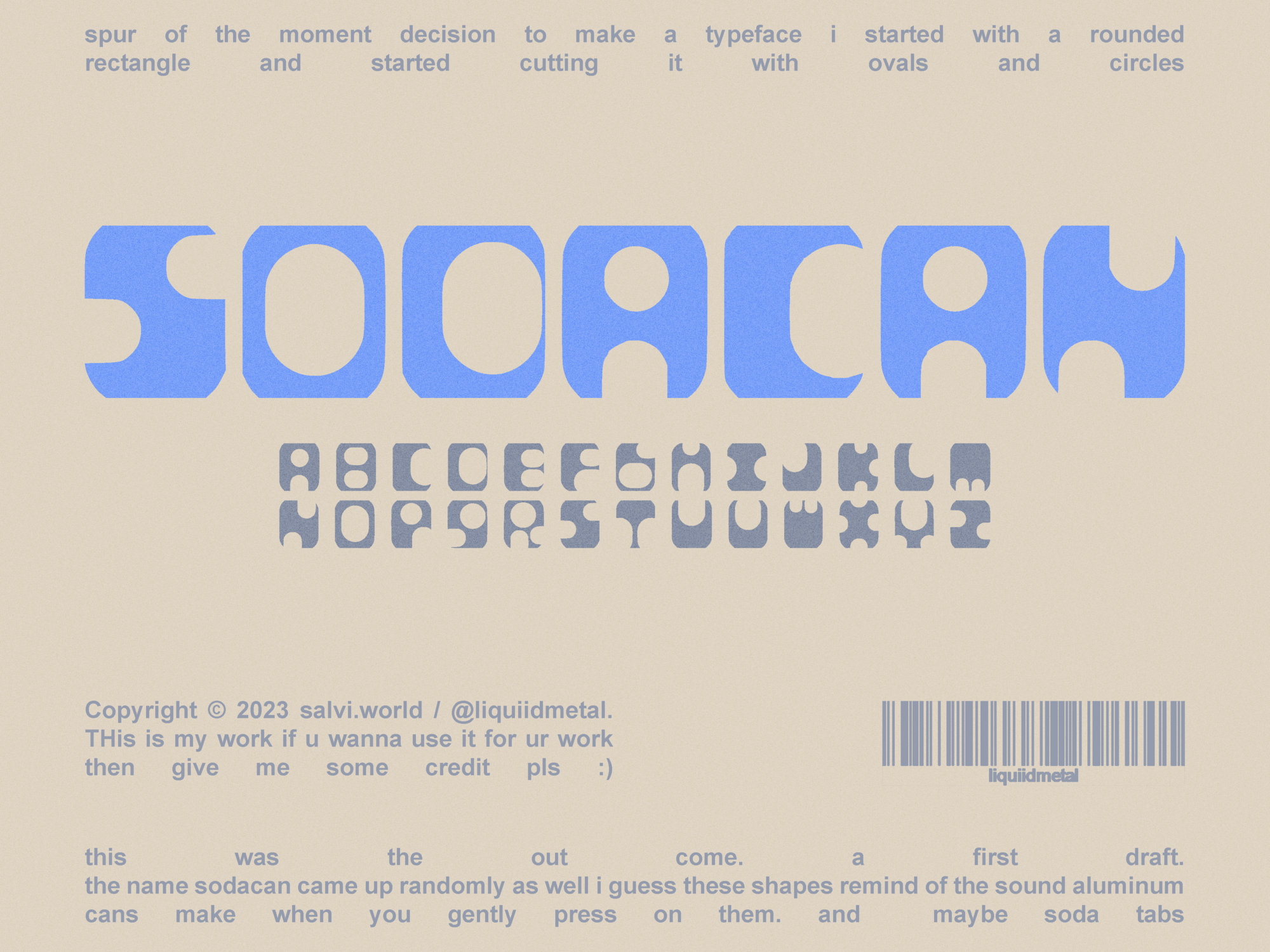
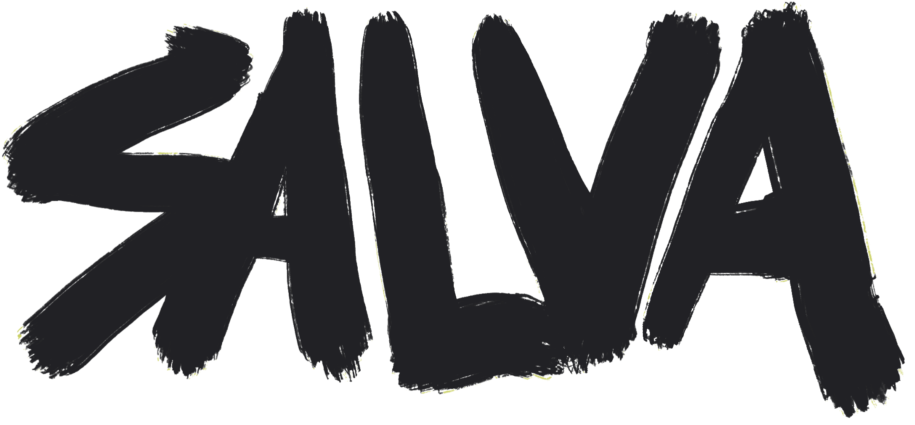
Typeface Design / Typography
SODACAN is an original typeface designed and built entirely from scratch. The letterforms draw from bold display type, graffiti energy, and industrial aesthetics — thick, chunky, and unapologetically heavy.
Designed to hold its own on posters, apparel, and anything that needs to hit hard. Each glyph was crafted to feel consistent as a family while still having its own personality.
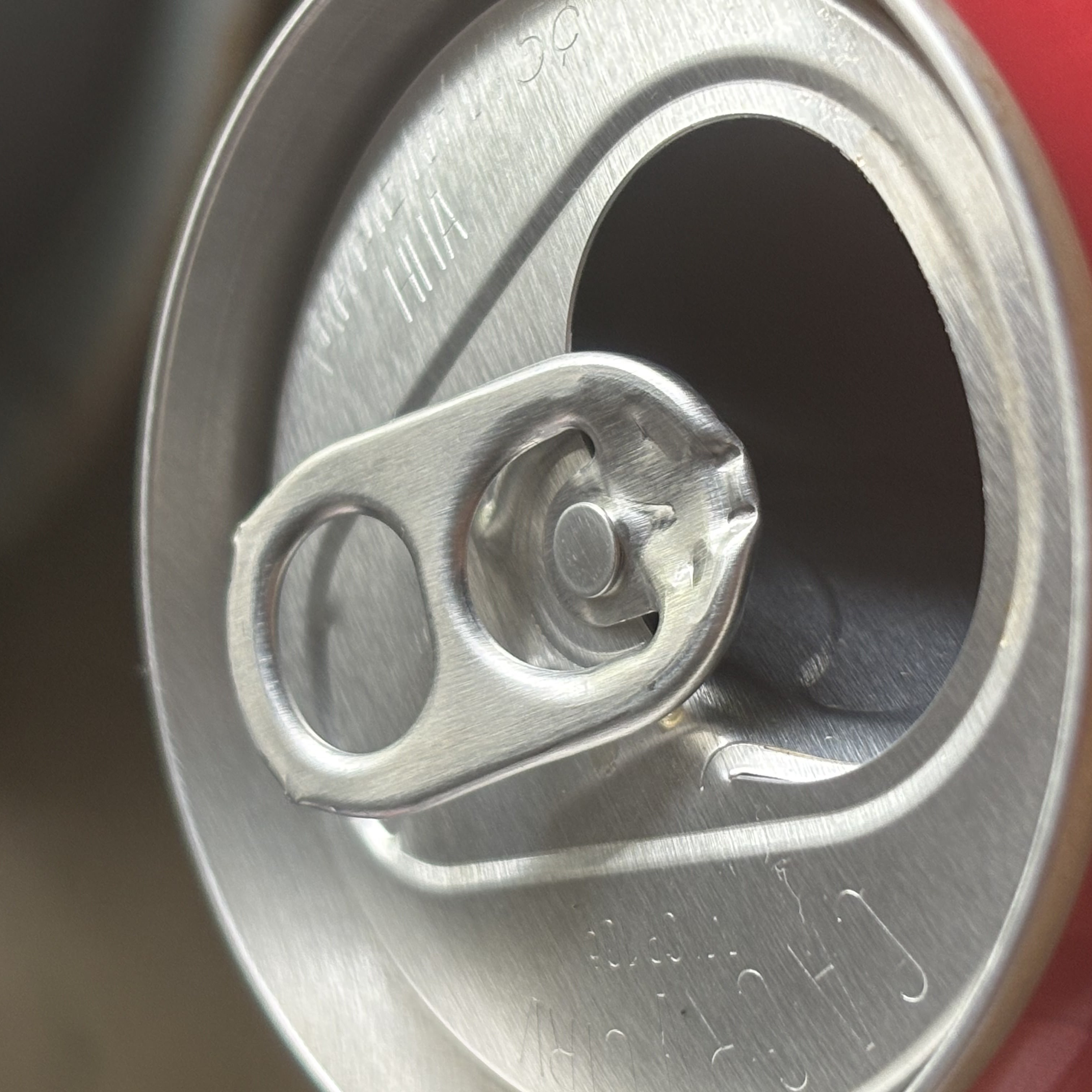
The name draws from the aluminum soda can tab — that stamped piece of industrial type nobody notices but everybody has touched. Punched-out, thick, manufactured. A font pressed out of metal, not drawn on paper.

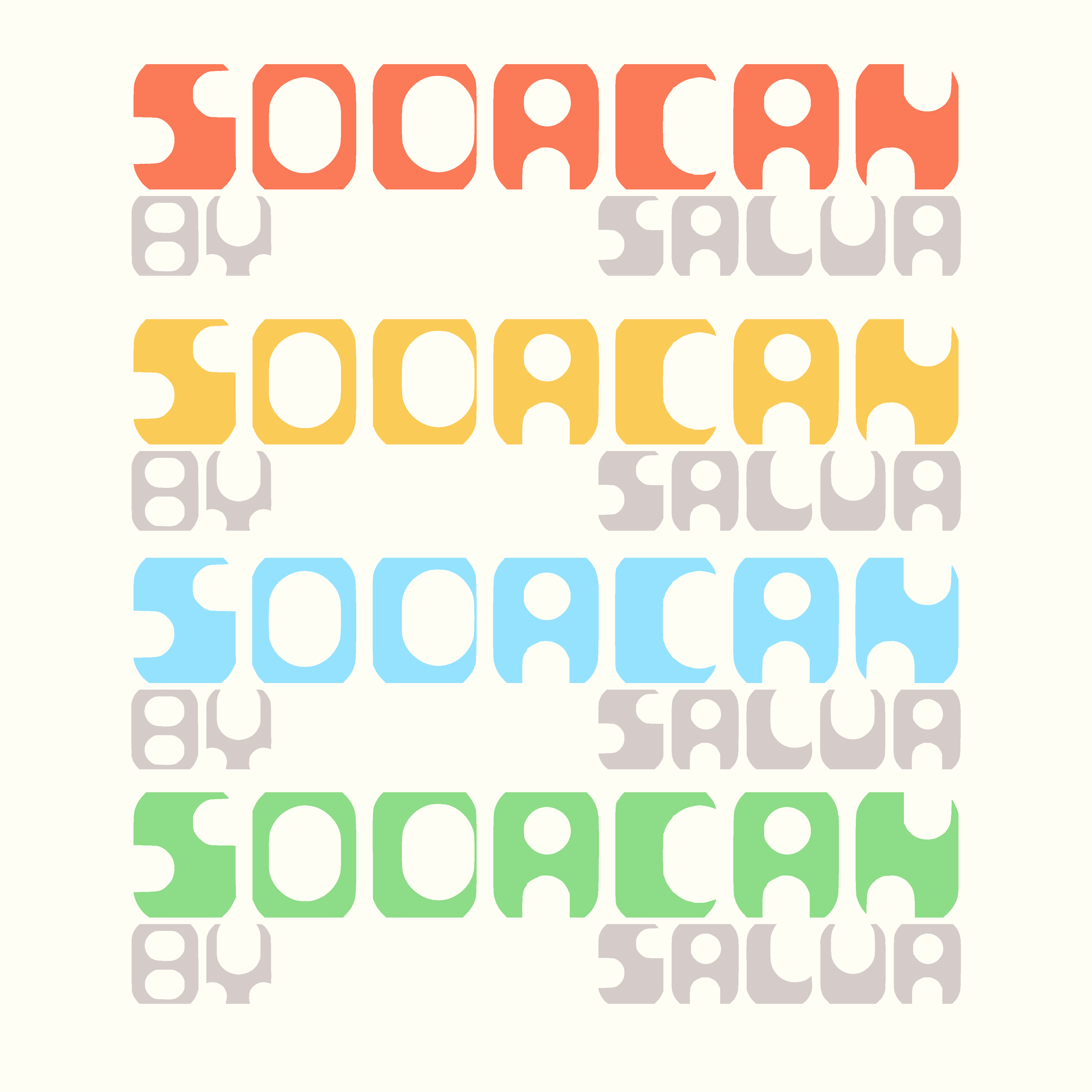
The color variant of the alphabet explores how the typeface holds up in a full palette — each letter treated as its own object, proving the design works as much in isolation as it does in motion.
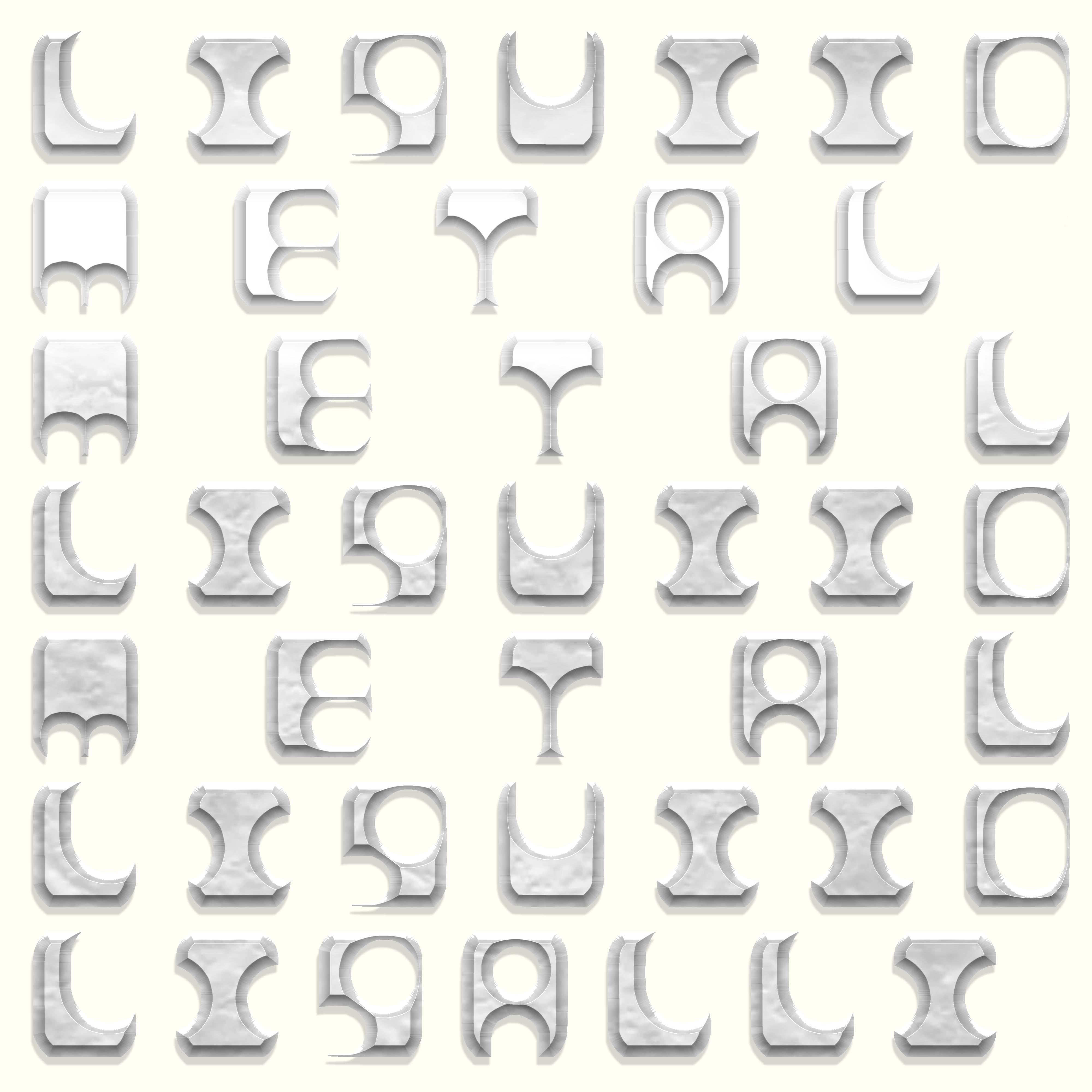
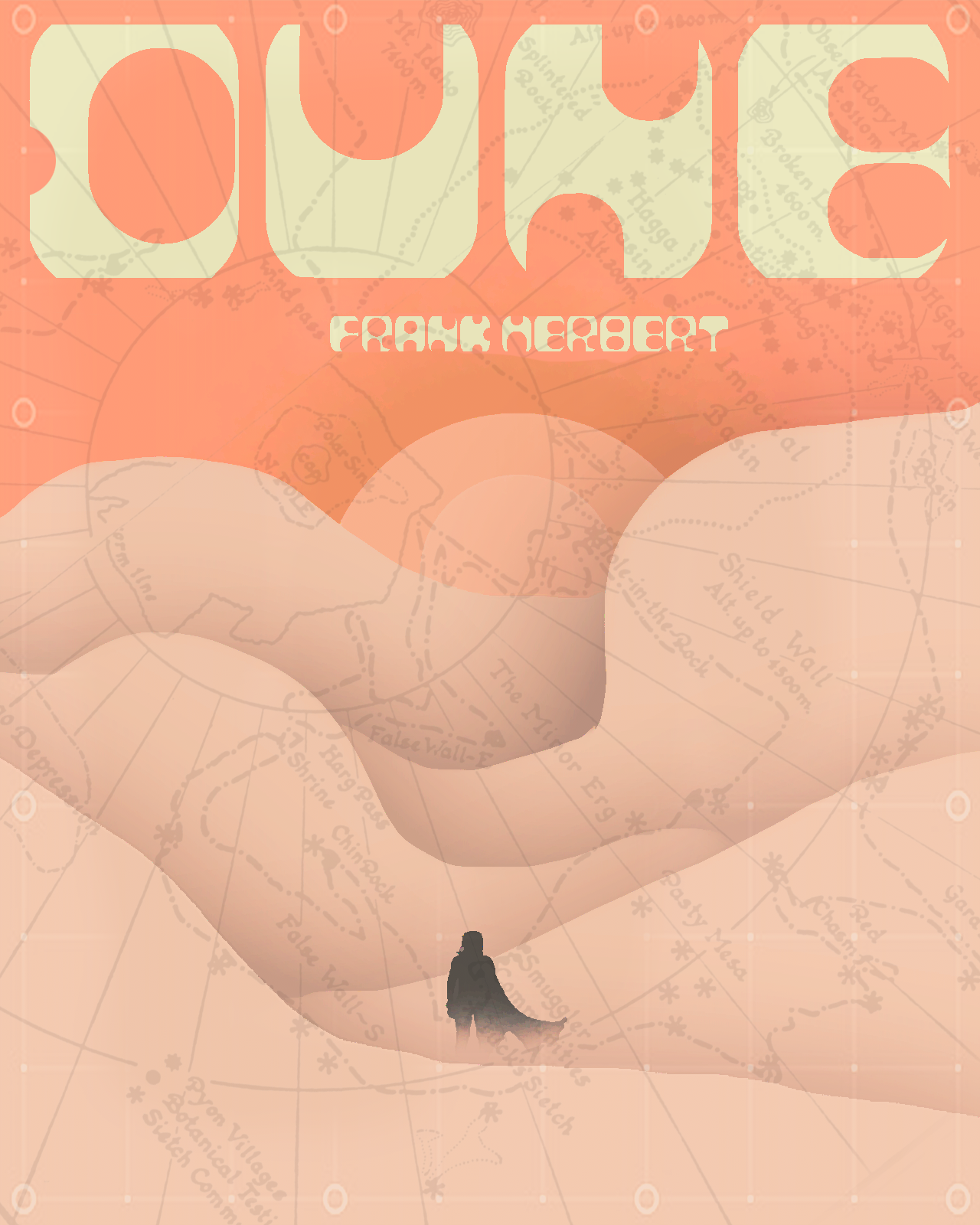
The final poster and metal render demonstrate the typeface in applied use — showing SODACAN as more than just letters, but a full visual identity system in itself.